Context
Thinking Local and Supporting Local were two halves of one project in Term 3 of my first year (BMD1R6 Interdisciplinary Design Foundation). In the first half I researched a local space and designed a solution. In the second I branded it and made everything needed to launch it: guidelines, a poster, an animated logo, an explainer video and a hi-fi prototype.
Waterview Reserve is a council park near my apartment, with a playground, skate park, BMX track and cycleways running into it, so all sorts of locals use it through the day.
Start with what people actually do
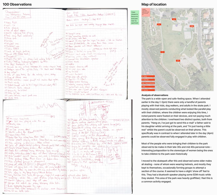
I live near the park, so I went in thinking I already knew how it worked. Writing down 100 observations across two afternoons showed me how much I’d been missing. At 2pm a lot of parents were on their phones while their kids played (“Hang on, I’ve just got to send this email”). By 4pm they were playing with them. And near one bin I found a car bumper dumped right beside it, even though the bin wasn’t full.
Design thinking
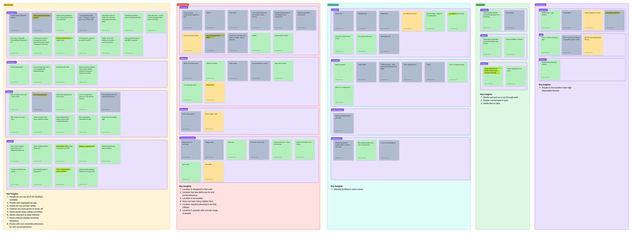
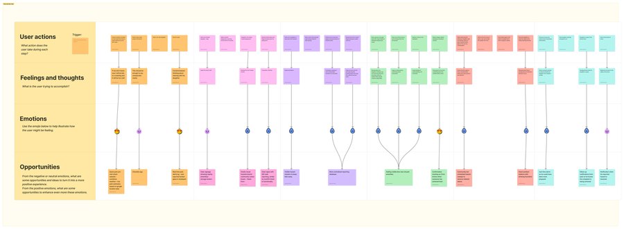
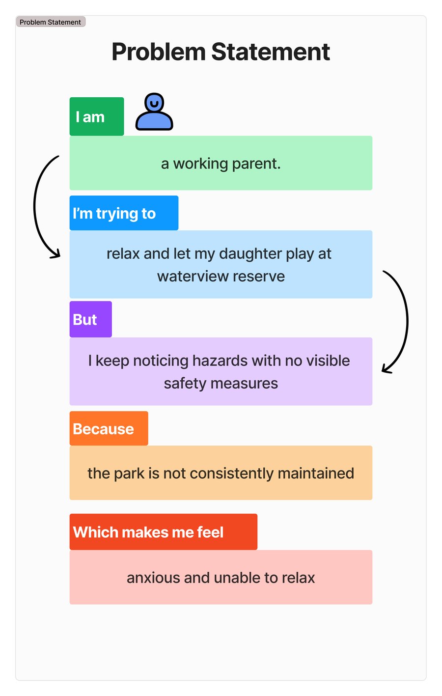
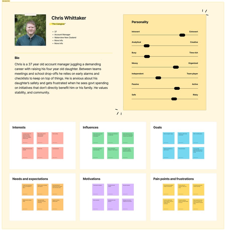
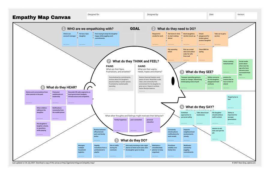
Observations sorted into an affinity map, then a persona, empathy map and journey map, leading to one problem statement.
Two rounds of ideas, including a “worst idea” round, before choosing an app.
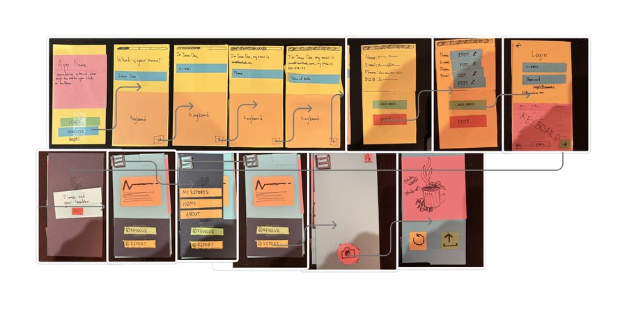
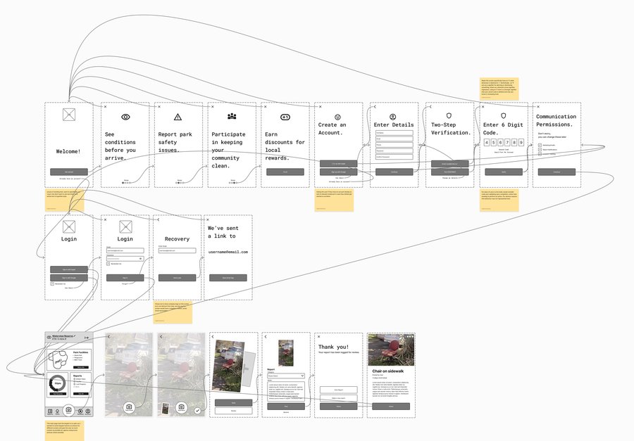
A paper prototype of onboarding, login and reporting, then digital wireframes.
Two three-hour sessions with classmates, iterating on the design from their feedback.
A brand and guidelines, then a poster, explainer video and hi-fi prototype.
The problem
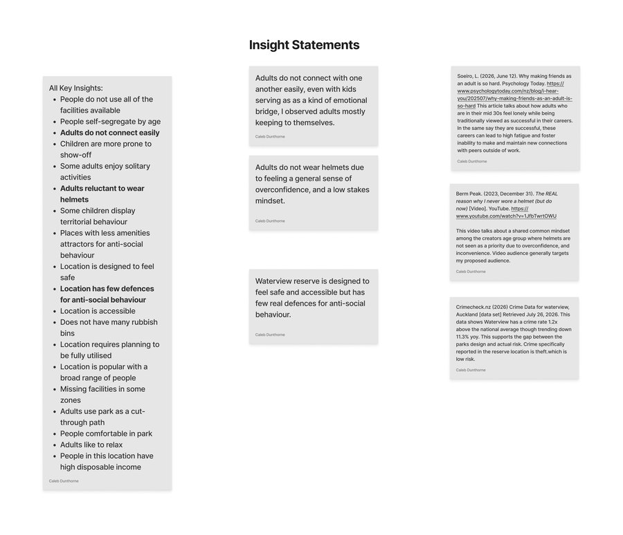
Two insights stood out as the things most stopping parents from relaxing while their kids played.
- Dumped rubbish. People were dumping rubbish next to bins that weren’t full. It’s not just this park: Auckland Council received more than 24,000 illegal dumping reports in a year, up from 16,681 the year before (Lin, 2026).
- It feels riskier than it is. Waterview’s crime rate sits at 1.2 times the national average, but it’s trending down 11.3% a year and is mostly low-risk theft. The state of the park was making it feel less safe than it really is.
- No way to know. Parents had no way to report a hazard, or to check a park before they arrived.
- The problem statement. I’m a working parent trying to relax while my child plays, but I keep noticing hazards and the park isn’t consistently maintained, which makes me anxious.
From paper prototype to app
I ran two rounds of ideas. The second was a “worst idea” round, with things like flying rubbish-collecting robots and force-field domes over playgrounds. It sounds pointless, but it stopped me going with the obvious answer. I chose an app that lets parents report hazards so they get flagged faster, and see what’s been reported before they leave home. An app can’t add lighting or change how the park is laid out, so instead of overpromising on anti-social behaviour, it gives parents certainty about what they’re walking into.
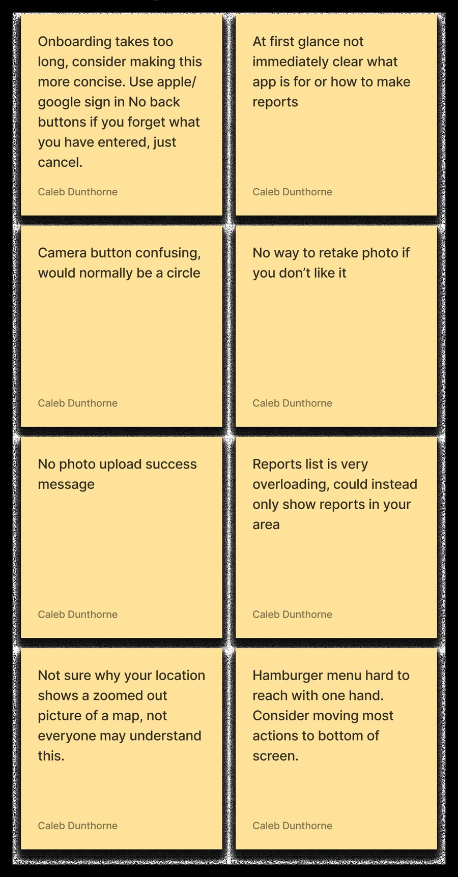
I made a paper prototype of onboarding, login and reporting, turned it into a digital prototype, and went through it with classmates over two three-hour sessions. Through their feedback I iterated on the design. I added a short feature reel at the start so it’s clear what the app is for, cut down sign-up and added Apple and Google sign-in, and added a button to retake a photo. For the menu, I looked at industry examples to see how other apps are laid out, and added an easy-to-reach bottom tab bar with most of the app’s controls.
The brand
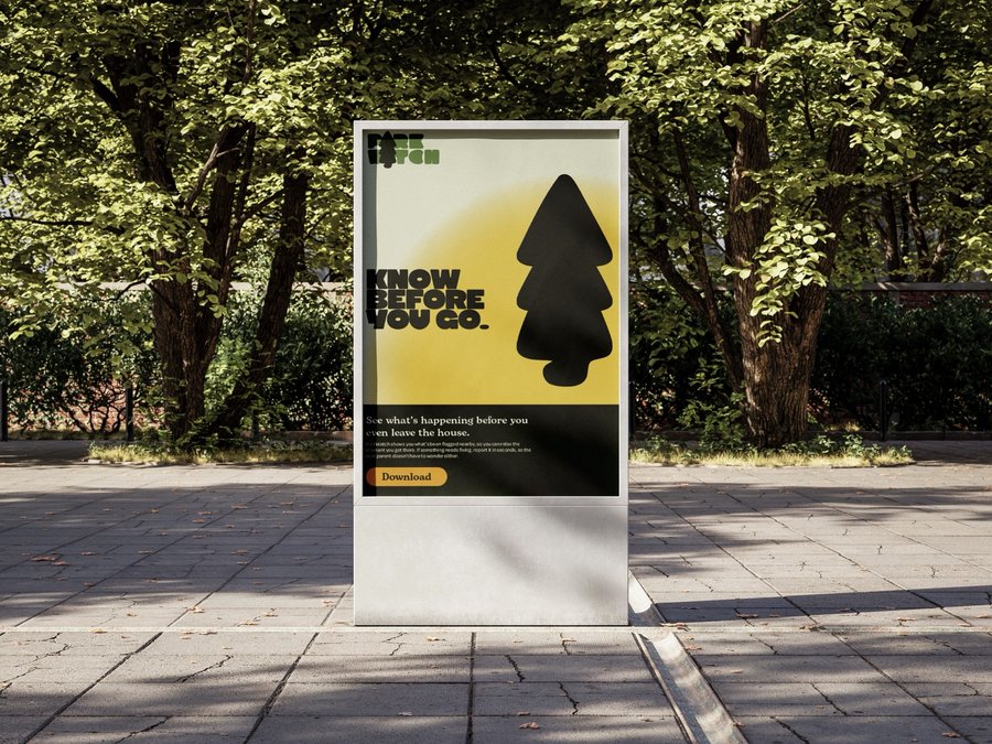
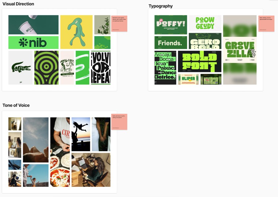
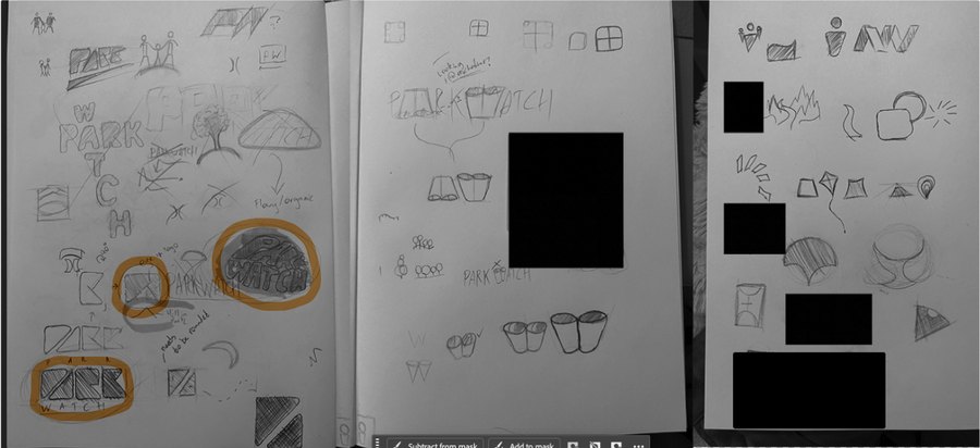
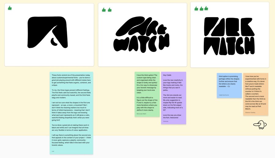
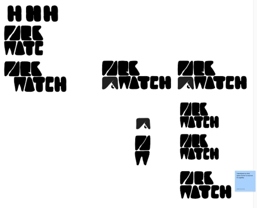
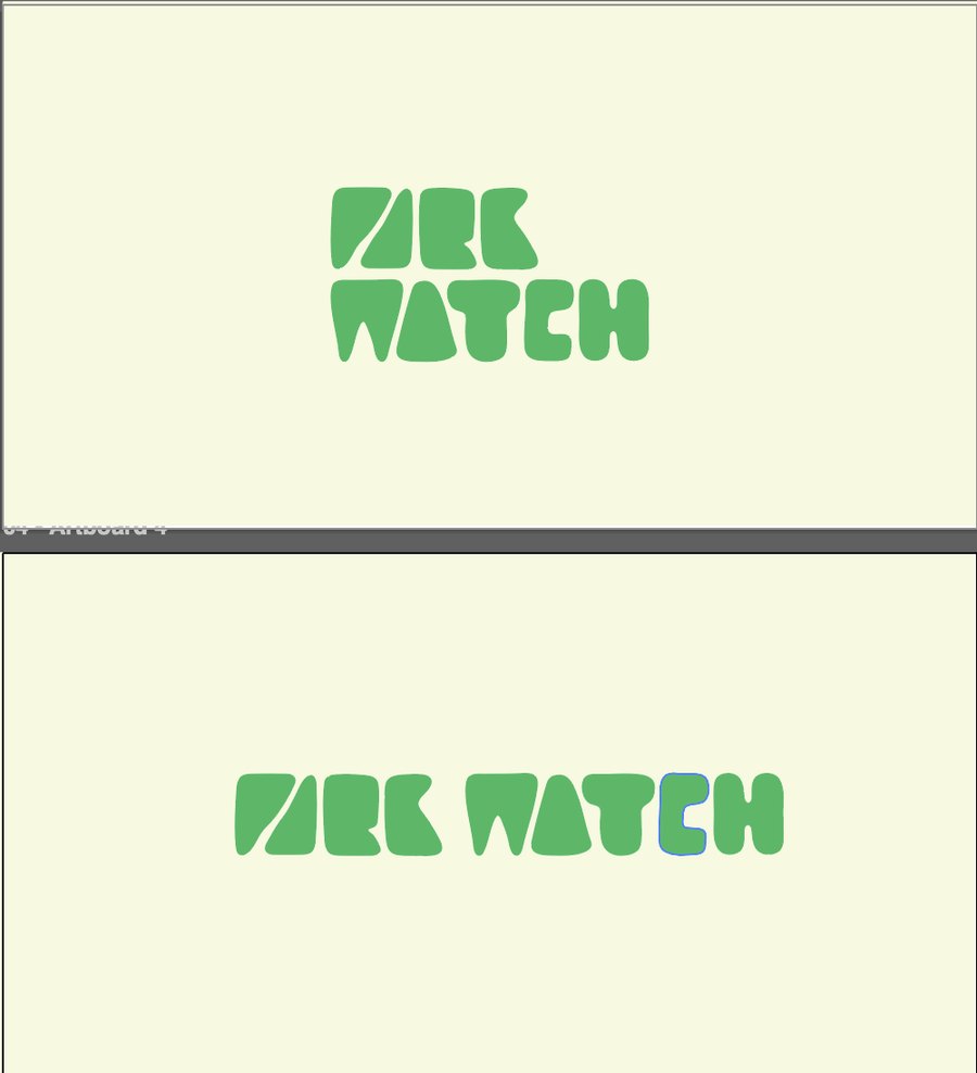
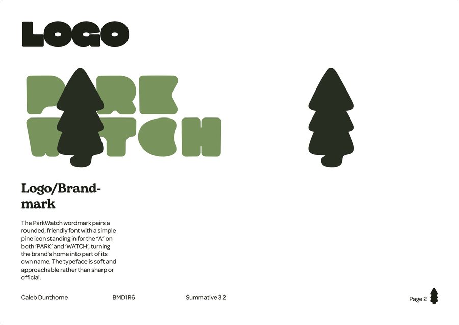
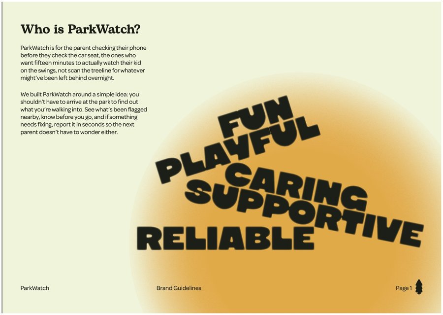
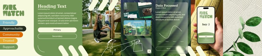
ParkWatch should feel like a helpful friend, not a security app, so the values are fun, playful, caring, supportive and reliable. I sketched logo ideas by hand, digitised the three strongest with Illustrator’s blob brush, and asked classmates which worked best. They chose the bold, chunky wordmark. It was actually my least favourite, and in the first version the W read as an M, so I angled the base of the letter to fix it. A pine tree stands in for the A in both PARK and WATCH.
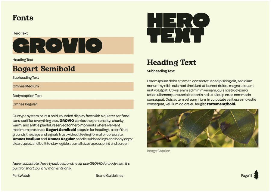
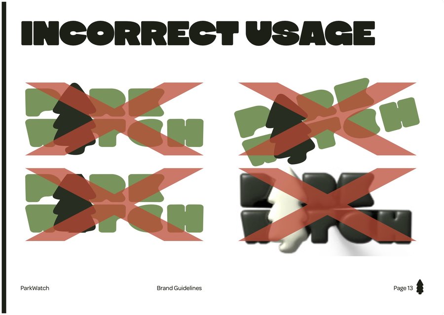
The guidelines cover the logo, clear space, minimum size, a type system, the colours and incorrect use.
Colour palette
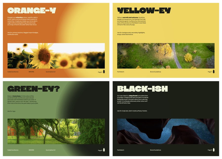
I wanted earthy tones that feel warm and inviting. Each colour has one job.
#CD702AAttention: buttons, alerts and flagged reports.
#EFD662Warmth and welcome, for backgrounds and highlights.
#78935CHome base. The colour of the logo.
#282E20A deep forest green, not pure black. Body text and dark screens.
#F6FAE1The neutral, for backgrounds and breathing room.
Testing, branding and launch

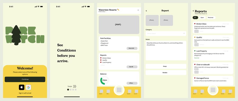
Deliverables
Research
100 observations, an affinity map, a persona, an empathy map and journey maps.
Prototype
Paper, then digital wireframes tested with classmates, then a clickable prototype in Figma.
Brand guidelines
Logo, clear space, minimum size, type, colour and incorrect use.
Poster campaign
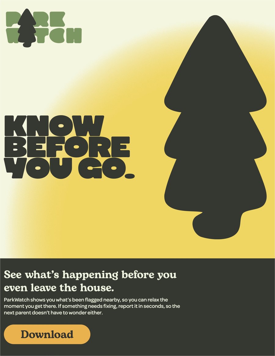
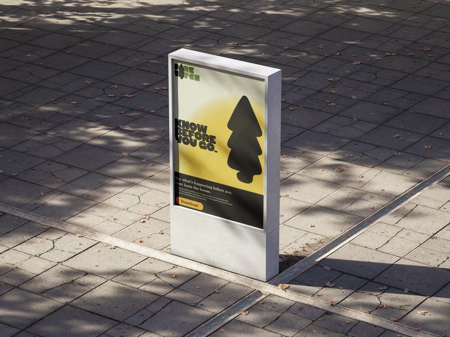
An A3 poster for community noticeboards, libraries and park signage.
Motion
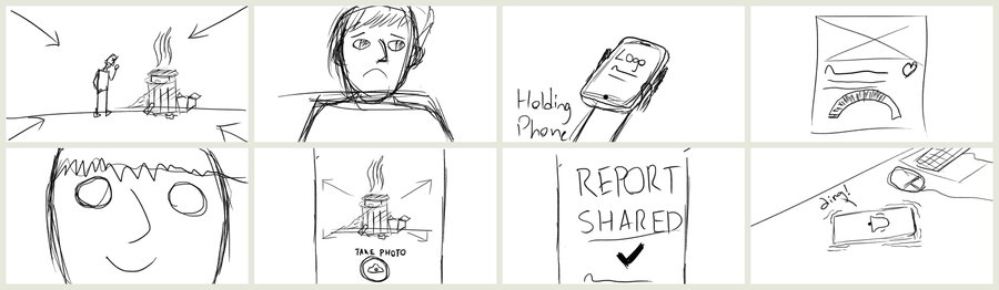
A 30-second explainer video with my own voiceover, and an animated logo.
What I took from it
I enjoyed researching my local area a lot. I thought I knew it, or at least had a rough idea of it, but it was really interesting just observing how the space was actually used.
I also learnt who to ask for feedback. People close to you will be kind no matter what. Sitting down with classmates who questioned things got me feedback that actually improved the design. And with the logo, I went with what testing showed over my own favourite, even though I still think it could be more legible.
“You shouldn’t have to arrive at the park to find out what you’re walking into.”— The ParkWatch brand story
In short
A solo project from observation to launch: time spent watching my local park turned into one clear problem, a tested app concept, a full brand and a campaign to launch it.