Context
This one ran across three papers in Term 2 of my first year: Contextual Studies (BMD1R3), Photographic Studies (BMD1R4) and Digital Image Foundation (BMD1R5).
My first idea was a New Zealand travel company in 3026. I imagined that by then Aotearoa had turned into a hyper-urbanised, corporate cyberpunk world where nature has been replaced by megacities, and the main thing people want is to escape. The company would take you back to the Pink and White Terraces on Lake Rotomahana, which were called the eighth wonder of the world before the Tarawera eruption buried them in 1886.
I spent a lot of time researching the terraces. Te Tarata, the White Terrace, was the bigger of the two, with clear turquoise water in white silica steps that looked like marble staircases. Te Otukapuarangi, the Pink Terrace, had calmer water, so it was where visitors went to bathe. Hochstetter’s 1859 map, modern depth maps and a GNS Science sonar survey from 2011 show the lower tiers are still there, about 60 metres under the lake.
Selling an escape
Setting the company in 3026 gave it a really high-tech feel, selling a destination that is completely natural, historical and lost. Basically an escape from digital overload. I also looked at the design conventions of luxury travel, which come down to detail, privacy, space and comfort. You can even see it in the photography. First class cabins get shot with a wide lens so they look roomy, and economy gets shot with a narrow lens so it feels cramped.
My process
Life in 1926, today and 3026, the terraces, and how luxury and economy travel are designed differently.
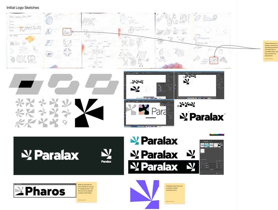
Name ideas and logo sketches, then building the Paralax logo in Illustrator.
Portraits of the travellers and prop shots, shot in RAW on manual, with model releases.
Changing the destination, then making the poster, pamphlet, social posts and mockups.
My photos didn’t match my destination
When I got to the production stage I realised the plan and the photos I’d actually taken didn’t line up.
- Two opposites. A neon future company and a warm, spa-like historical landmark. One of my lecturers pointed out they were opposites and really hard to combine, which was fair.
- The portraits went dark. My final portraits ended up moody and low-light, with tight framing and dramatic contrast. Nothing like a relaxing day at the terraces.
- Ethics. Travellers would be going back knowing what was about to happen to the terraces and the village nearby. It’s a place where people died, so it’s tapu, and there are ecological risks too, plus how it looks to sell that kind of trip.
Changing the story to fit the photos
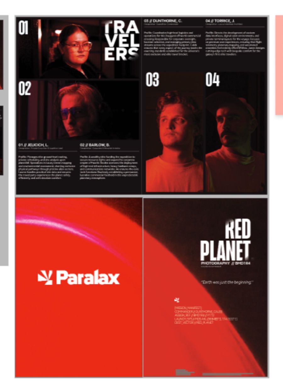
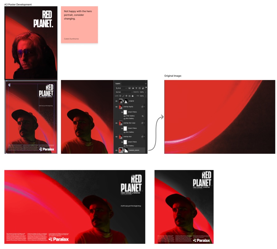
After talking to my lecturers I decided to keep my photos and change the company’s story and destination to suit the darker tone instead. While I was editing the photography document I used an out-of-focus test shot of a light on my wall as a background, and realised it looked like a planet. So I made the destination a planet, which is how Red Planet and the line “Earth was just the beginning” came about. The name Paralax comes from parallax, which is when an object seems to shift depending on where you’re looking at it from. For the logo I wanted something geometric, with light rays to symbolise hope that also look like one-point perspective. I changed its colour from teal to purple to feel more luxurious, and the campaign itself ended up deep red and black.
Poster development
What I made
Identity
The Paralax logo and the tagline “Earth was just the beginning.”
Poster
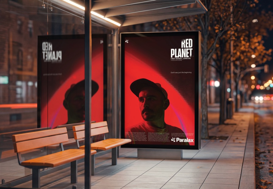
An A3 poster, mocked up at a bus stop.
Pamphlet
A double-sided A5 pamphlet introducing the travellers and the first voyage.
Social
Portrait and landscape feed posts, mocked up on a phone.
What I learnt
I’m really proud of how the photography document and the Paralax layouts turned out, but my first presentation didn’t go how I wanted. I spent too much time building the slide document itself, setting up master pages, dynamic sections and paragraph and character styles, and not enough time actually understanding my content.
The bigger lesson was further back. I couldn’t picture what I wanted to make from day one, and it wasn’t clear to me then that a neon future and a historical landmark just don’t fit together. Next time I’d test the idea against my photos a lot earlier and let the strongest work lead.
In short
A made-up luxury travel brand that started at the Pink and White Terraces and ended up on a red planet. The brand, photography, poster, pamphlet and social posts all come from my own shoot.