Context
This was the first summative of my Bachelor of Media Design, across Design Principles (BMD1R1) and Design Studio (BMD1R2). Everyone got a random book, and I got Snow Country by Yasunari Kawabata, which he wrote between 1934 and 1947.
Kawabata was the first Japanese author to win the Nobel Prize in Literature. The book follows Shimamura, a wealthy and fairly cynical man from Tokyo, and Komako, an onsen geisha in a remote hot-spring village. He keeps her at arm’s length the whole way through.
Looking into the era helped a lot. Japanese design at the time was dominated by bold propaganda pushing national unity and strength. Kawabata’s writing is the opposite of that. It’s quiet, and it focuses on fleeting beauty and loneliness. While the posters were demanding loyalty to the state, the novel retreats into private melancholy and the snowy isolation of the mountains.
Isolation
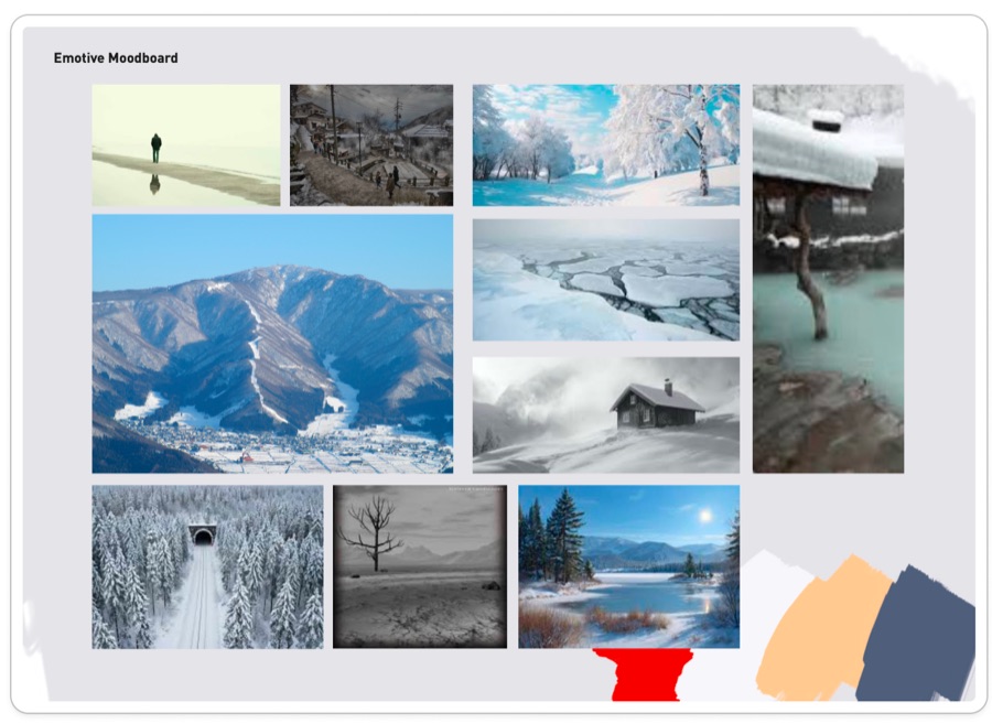
I chose isolation as the key theme. I wanted a major visual element to represent being disconnected, because the characters are emotionally and physically cut off from the rest of the world. I was looking at the vast, empty landscapes of the snow country and how the environment itself creates a sense of loneliness. By using a lot of white space or a single focal point, I wanted to capture that feeling of a beauty that is cold and unreachable.
My process
The story, Kawabata, and what Japan was like when he wrote it.
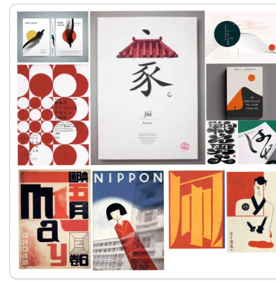
An emotive moodboard about isolation, and a visual direction moodboard.
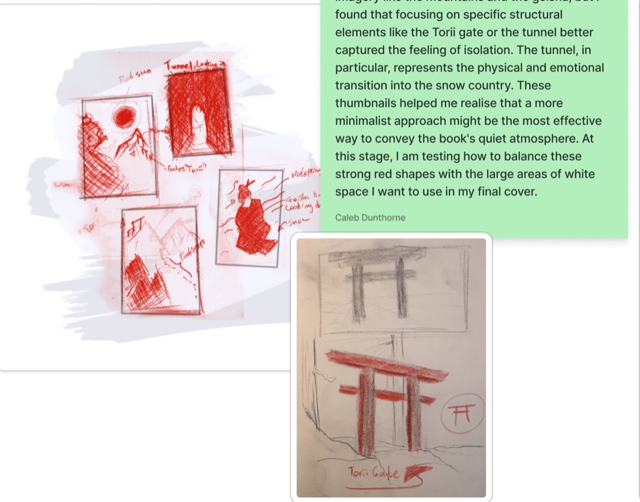
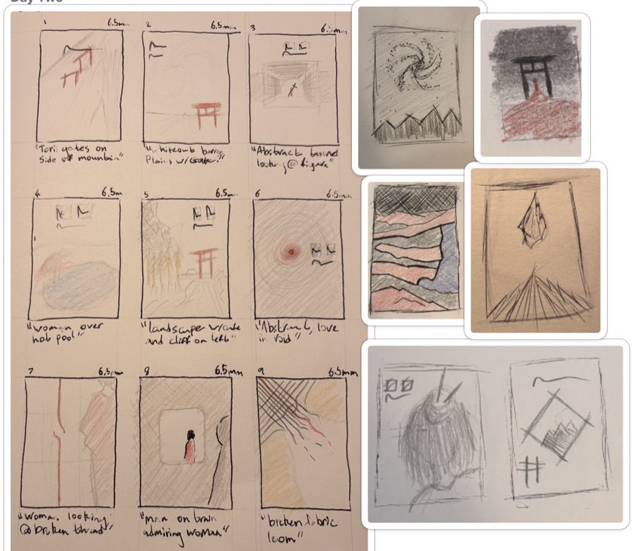
Over 20 thumbnail sketches across two days.
Digitising, testing colours, the print file and a Gibbs reflection.
Making a quiet book stand out
The design from that era was loud and the book isn’t, so I had to find something in between. The brief also had a few rules.
- No outsourced images. Every bit of artwork had to be my own.
- Not too literal. My first ideas were mountains and geisha, which felt too obvious. I needed one image that carried the feeling.
- Print ready. A full jacket with the spine, blurbs, bio, barcode and price, set up with crop and bleed marks.
One gate and one figure
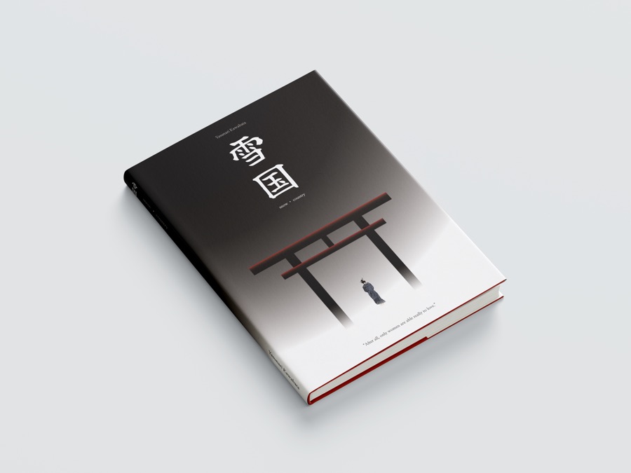
My first sketches used pretty literal imagery like the mountains and the geisha. I found that focusing on structural things like the torii gate or the train tunnel captured the feeling of isolation better, especially the tunnel, since it’s the physical and emotional transition into the snow country. The thumbnails made me realise a minimalist approach was the best way to get across how quiet the book is. On the final cover the background fades from near black down to white like falling snow, the red-edged torii gate dissolves into it, one figure stands underneath, and the title 雪国 (the words ‘snow’ and ‘country’ in Japanese) sits at the top in big kanji.
My colour palette
I picked this palette to modernise the book while keeping how cold and heavy the story feels.
#C03221A really deep red, and the colour of the Japanese flag. It’s also tied to love and passion, as well as danger and other negative themes, which all come up in the book.
#F7F7FFPerfect for something like the face of a geisha, who wear traditional white makeup. It also stands in for the snowy landscape.
#F2D0A4I was thinking of using this for text, or for Shimamura’s skin.
#545E75I wanted a blue to contrast the other colours, and to keep it pretty cold to match the setting.
Moodboard to final cover
What the jacket includes
Front cover
The kanji title, author name, artwork and a quote from the book.
Spine
Title and author running down the spine to match the front.
Back and flaps
Story blurb, author bio, endorsements, barcode and price.
Process
Research, two moodboards, 20+ thumbnails and the whole process documented in FigJam.