Why I built my own
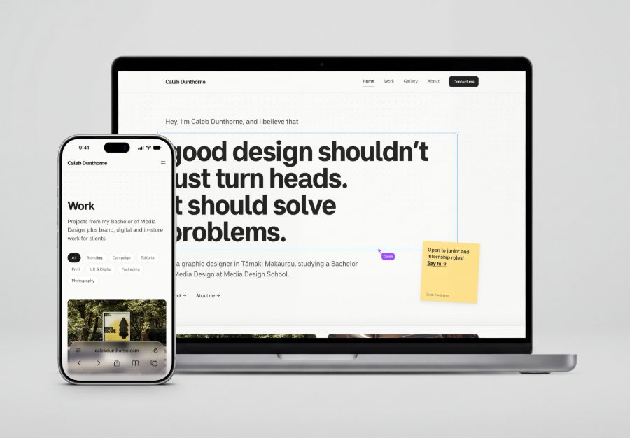
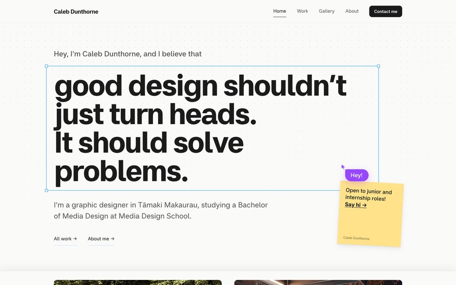
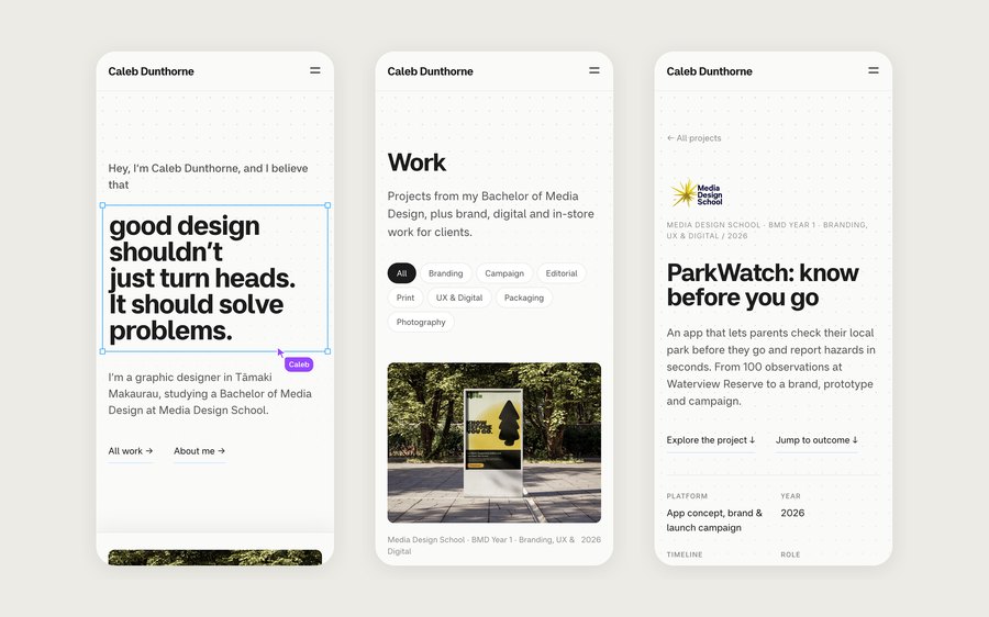
A lot of portfolio templates end up looking the same, and I wanted the site itself to show how I think. The idea came from the tool I spend most of my time in. The home page is a canvas: my headline sits in a selected frame, my cursor is resting on it, and a sticky note says the one thing I want every visitor to know, that I’m open to junior and internship roles.
I want to be upfront about how it was built. I didn’t hand-write the code. I directed Claude Code, Anthropic’s AI coding tool, and it wrote the code. The idea, the look, how the pages are structured and how the editor works were my decisions, and I checked each change on real screens before it went live.
My process
A portfolio that looks and behaves like the canvas I design on.
Home, Work, Gallery and About, plus one case-study layout every project shares.
Writing each project up as the brief, what I did and how it turned out.
Checking it on phones, laptops and big screens, and fixing what broke.
Built for people who skim
People looking at a junior designer’s portfolio are busy. Some will give it thirty seconds on their phone, others will read a whole case study. The site had to work for both.
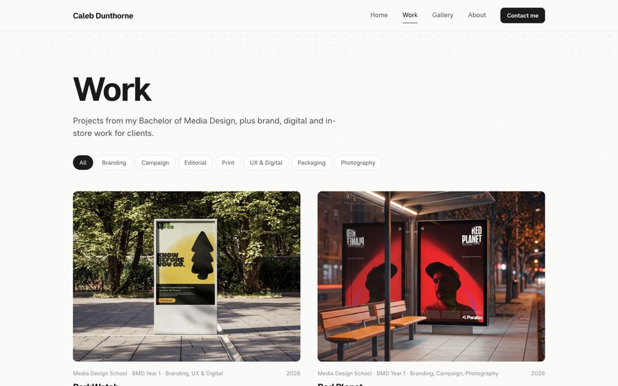
- Get to the work fast. The home page leads with four projects, and the Work page filters by category, so someone looking for packaging or branding finds it straight away.
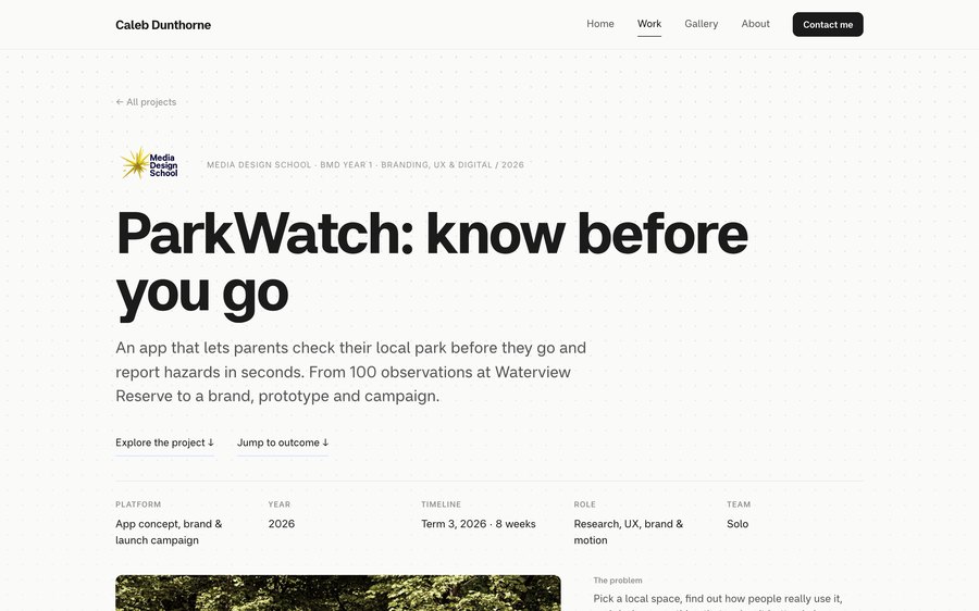
- Keep it consistent. Every case study uses the same layout: the key details at the top, then the brief, the process and the outcome.
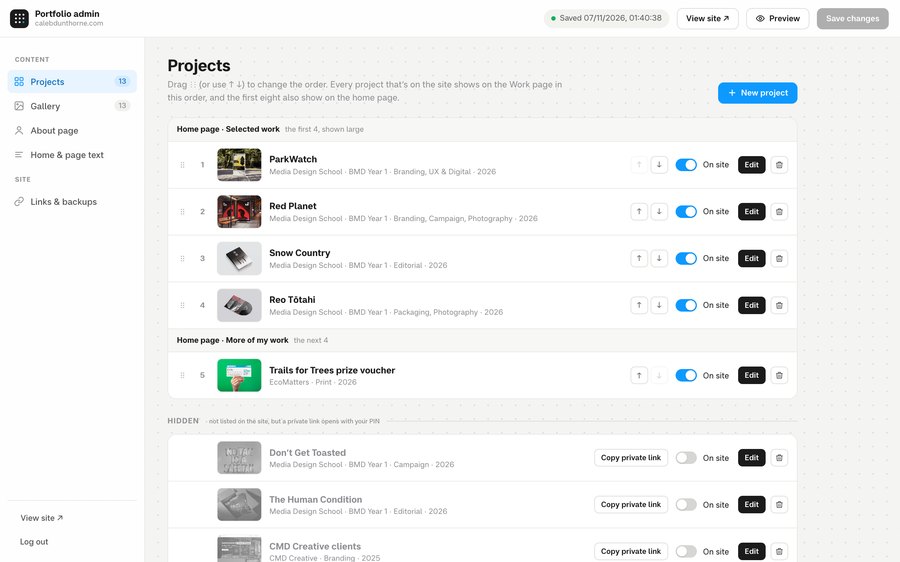
- Keep it mine to run. I didn’t want to rely on anyone else every time I finished a project, so it needed an editor I could use myself.
A canvas, a case-study system and an editor
The canvas idea runs through the home page, from the dotted background to the selection handles. Once per visit my cursor says hi, the way a collaborator does in a shared file. As you scroll, the projects slide up over the headline like a sheet.
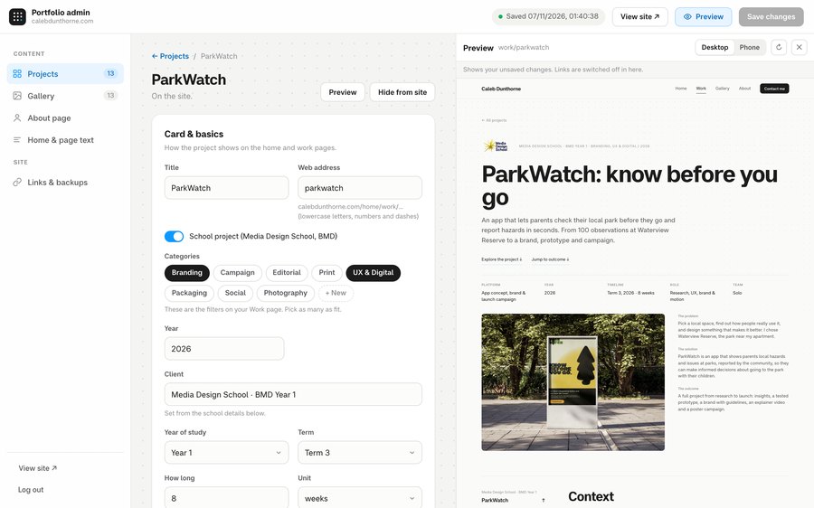
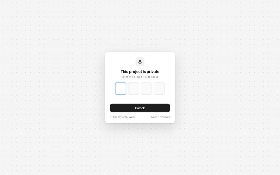
Behind the site is an editor I set up for myself. I build each case study from blocks, like text, image grids, steps and stats, and check a live preview on desktop and phone before anything goes live. School projects just ask for my year, term and how long the project took, so they’re always written the same way. I can also hide a project and share a private link to it that needs a PIN.
Around the site
What’s in it
Canvas home page
A selected headline, a multiplayer cursor and a sticky note.
Category filters
Projects can have more than one category, like tags.
Case-study layout
One structure for every project, with a contents bar to jump between sections.
Block editor
Pages built from blocks I can add, hide and drag into order.
Private projects
Hidden work I can share with a link and a PIN.
Any screen
Tested on phones, small laptops and big monitors.
What I learnt
Testing on other people’s devices mattered more than I expected. A friend opened the site on an older Dell XPS, and the links under my headline were stuck off the bottom of his screen, because the pinned headline didn’t fit on his laptop. It looked fine on everything I owned. Now the page checks whether the headline fits and scrolls normally when it doesn’t.
I also learnt how much of a portfolio is editing. I took my day job off the home page so the site leads with design, and kept that work to the projects themselves and my About page.
In short
My portfolio site, designed and art-directed by me and built by directing Claude Code. It’s laid out like a design canvas and has an editor behind it so I can run it myself.